Measuring Pop-up Store Performance — What Foot Traffic Alone Misses
Foot traffic shows only half of pop-up store performance. Engagement, return intent, hourly patterns, and qualitative feedback — a metrics framework you can actually report to headquarters.
Foot traffic shows you half of pop-up store performance at best. Which was more successful — the pop-up that drew 30,000 visitors or the one that drew 10,000? The answer depends on what people came to do and how they felt about it. This guide covers the metrics that matter beyond the door count, and how to package them so a report to headquarters or a brand partner actually lands.
Why foot traffic is half a metric
Visitor counts are easy to collect and satisfying to announce. But they can't tell you three things.
- Quality: someone who wandered in and someone who sought out your brand both count as one.
- Experience: the count doesn't distinguish visitors who left delighted from visitors who left because of the queue.
- What's next: it says nothing about how many will return or convert to your online channels.
If the goal is sales, purchase conversion matters more than raw traffic; if it's brand awareness, dwell, sharing, and return intent are closer to the point. Traffic is most useful as a denominator — the baseline for the participation and response rates below.
Five core pop-up metrics
| Metric | What it shows | How to collect it |
|---|---|---|
| Visit volume | Absolute reach; the denominator for everything else | Door count, tallied by day |
| Participation rate | Share who actually joined the experience or activation | Participants ÷ visitors |
| Satisfaction | Quality of the experience (star rating / score) | 30-second exit survey |
| Return / recommend intent | Likelihood of a next step | Survey multiple-choice question |
| Visit driver | Which channel brought people in | Survey multiple-choice question (social, word of mouth, walk-by) |
None of these require heavy infrastructure. Everything except visit volume comes out of one well-designed survey. For question design, see the satisfaction survey guide.
What breaking it down by day and hour reveals
Totals state conclusions; breakdowns explain causes.
- Daily trend: how long the opening buzz lasts, how wide the weekday–weekend gap is — and when a second marketing push is worth it.
- Hourly pattern: if satisfaction dips at peak hours, the problem is congestion, not product. That's your case for staffing changes and entry pacing.
- Question cross-cuts: the group that rates five stars but won't commit to returning; first-timers with high satisfaction. Crossing two questions turns "do better" into "here, specifically."
Reading this data once mid-run changes how you operate the remaining weeks. Totals can wait until the end; trends are only valuable while you can still act on them.
The "why" behind the score — handling qualitative feedback
Open-ended comments deserve weight even in small numbers. Three habits make them useful.
- Cluster by theme: sorting comments into a few buckets — waiting, stock, signage, product — makes repeated signals visible.
- Cross-check against scores: if the complaint cluster lines up with the hours where ratings dip, two independent signals point at the same problem. That's a priority even with a small sample.
- Quote them verbatim: one real sentence — "the wait was rough" — persuades better than any chart. Pair your summary with two or three representative quotes.
Reporting to headquarters or a brand partner
A report gains force when it's structured as three statements rather than a pile of numbers.
- Results: how the core metrics performed against the goal (volume plus participation, satisfaction, intent)
- Findings: what the breakdowns revealed (peak patterns, top visit drivers, recurring feedback)
- Next: how the findings will shape the next pop-up or the permanent channels
The "next" section is what turns a pop-up from a one-off event into a learning asset. Say explicitly that this run's data is the baseline for the next one.
Collecting the metrics automatically — TagBooth
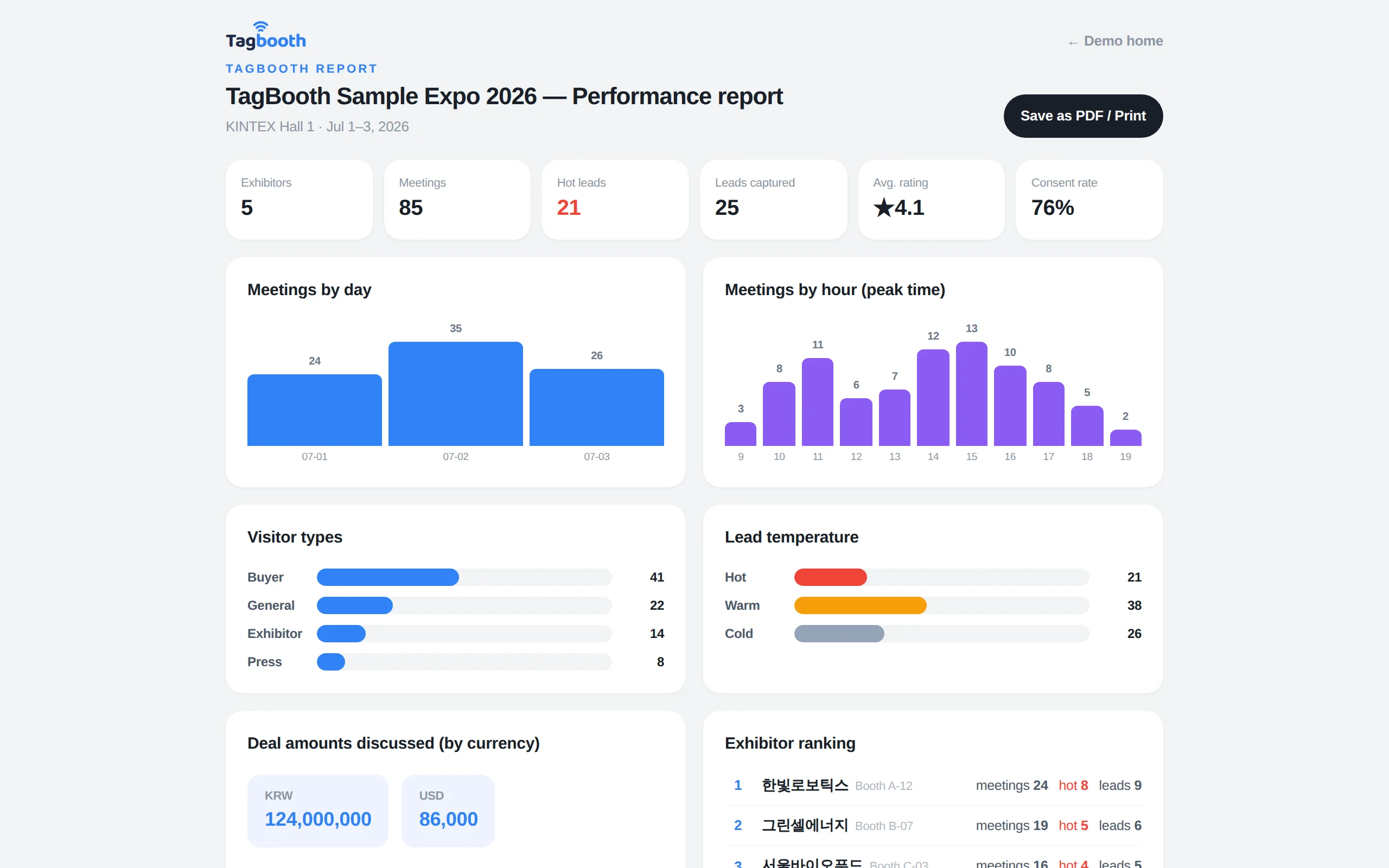
Everything on the list except visit volume — satisfaction, return intent, visit driver, open-ended feedback — comes out of a single TagBooth survey. Put up the QR and visitors respond anonymously in about 30 seconds with no app install; as responses accumulate, per-question charts and daily trends draw themselves.
The AI summary turns cross-patterns into plain sentences — "complaints about weekend-afternoon waits keep recurring" — and results export to PDF, Excel, or CSV, ready to paste into a head-office report. See a sample results report in the demo without signing up; the full flow is in how it works.
FAQ
How many KPIs should a pop-up store track?
Two or three tied to the primary goal. More metrics make the report thicker and the conclusion blurrier. Keep visit volume as the denominator, then go deep on conversion metrics if the goal is sales, or satisfaction and intent metrics if it's awareness.
What's the best way to count visitors?
Count at the entrance in hourly buckets — a total-only count makes peak analysis impossible later. If continuous counting isn't feasible, sampling a fixed window each hour (say, the first ten minutes) and extrapolating is a common field practice.
Survey respondents are only a fraction of visitors — is that representative?
You don't need a census to read trends and patterns. What matters is keeping collection conditions constant: same stand locations, same staff prompt, all run long. That's what makes day-to-day comparison valid. To lift the response rate itself, work on QR placement and the one-line staff prompt.
If the pop-up generates revenue, isn't revenue enough to report?
Revenue is essential but can't explain itself. Visit drivers, satisfaction, and return intent are what tell you how to reproduce or grow that revenue next time. Revenue plus reason data is what makes a report persuasive.